

By Andy Seidel
When you watch as many hours of NBA basketball as I do, you start noticing how many factors go into what game on a certain night you find yourself most interested in watching. The storylines between the two teams, the type of basketball they’ve been playing lately, the playoff picture implications, the mascots involved, the broadcasting team and whether or not it’s available in HD all factor in for me on a typical night.
Below all of those factors, but still relevant on my list, is the floor design of the court the two given teams will be playing on. I really, really enjoy an interesting and visually appealing court design, and the ones I love I get excited about whenever I see them on TV. While the one pictured above is not currently in use, if this is what the Hornets choose to play on next season, I will be very excited about it.
First things first, I like fun, colorful floor designs. The proposed Hornets court obviously covers those bases, but here are some other examples of ones I seriously love – past, present, and proposed but never utilized:


As you can see, I prefer fun, out of the box court designs that have something more going on than just empty space and a logo. Some courts can utilize the simple formula of a team’s logo and name well with a classic look, though – my favorite “classic” style courts are Philadelphia, Chicago, Boston, Portland and Brooklyn.

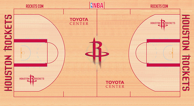
The ones I really can’t stand are the bland courts that don’t even pull off the classic look. If you’re not going to use the canvas that is an NBA court to make a bold statement, then at least pull together some retro coolness. A few floors fail to do even that, such as the Rockets current design:
The Phoenix Suns new court design bores me as well, even if the team that plays on it is fun as all hell:
![]()
My two least favorite, though, have to be the current courts of the Miami Heat and Cleveland Cavaliers. Not only do the courts come across as bland and boring to me, the color schemes are not visually appealing to me at all. Wine and gold? If the Cavs went for a darker shade of red then maybe I could see it working, but it’s pretty bad as is.

Yikes. Below you’ll find the gross Miami Heat court. I really don’t think that red and yellow look good together like this – it reminds me of McDonald’s and Big Macs. I also think that black and red together alone for the Heat could yield some really cool designs, especially if you incorporate the whole “court on fire” idea – but I doubt the reigning champs are that bold.

Well, that is all I have to say on this very important matter for now. Let’s cross our fingers and hope that the brilliant proposed Hornets court design is accepted!

I see a lot of interesting articles on your blog.
You have to spend a lot of time writing, i know how to save
you a lot of time, there is a tool that creates unique, SEO friendly posts in couple of minutes, just search in google – k2
unlimited content